Kaio™
AI-generated campaign.
PROJECT DETAILS
-
Kaio™ is an experimental footwear brand merging fashion design with avant-garde aesthetics. The launch of its first fashion sneaker became an opportunity to explore how AI-generated images and video could power a full campaign.
-
Using our custom AI campaign workflow, we generated every visual element—from concept frames and motion studies to final video lookbook assets. This end-to-end process allowed us to move with creative flexibility.
-
The outcome of the project was a fully AI-generated campaign and film treatment that brought Kaio™’s product story to life—from visuals and sound to motion and film, every element was crafted through generative tools.
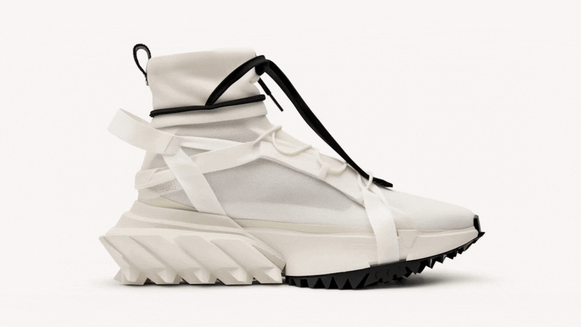
Kaio™ is a speculative footwear brand that exists at the intersection of fashion and digital art. To launch its first fashion sneaker the 01.7A, we created a campaign built entirely with AI-generated content.
Brief
The assignment was to create an end-to-end advertising campaign for Kaio™’s debut fashion sneaker—built entirely with AI-generated imagery, sound and video. The goal: produce a video lookbook that not only showcased the product, but demonstrated how AI can power brand storytelling across social, out of home, web and broadcast.

Visual Ethos
The look and feel of the campaign is defined by a tension between motion and structure—where constant movement is captured within clean, grid-based compositions. Visuals are layered, echoed, and unresolved, drawing from avant-garde fashion photography and the rhythm of social media feeds. The result is a world that feels both meticulously designed and endlessly in flux—expressing Kaio™'s identity as a brand in motion.

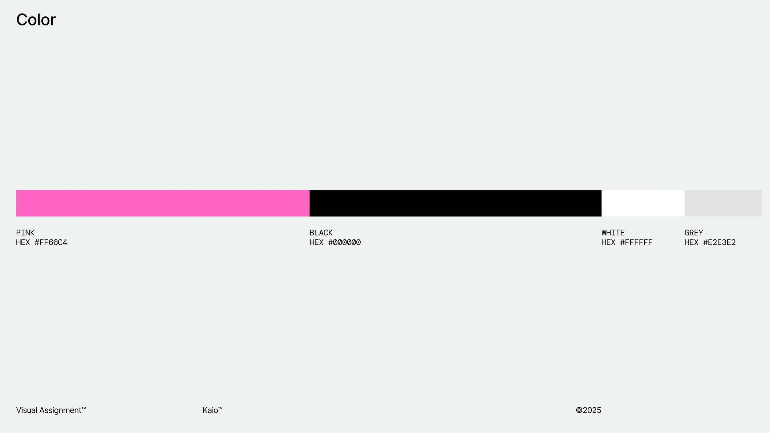
Color
The campaign leads with a bold use of pink—vibrant, loud, and attention-grabbing—deliberately clashing with a stark palette of black, white, and grey. This high-contrast combination creates a visual tension that reinforces the campaign’s kinetic energy. The result is a system that demands attention through bold, graphic impact.
Type
The typographic system juxtaposes elegance and force through the use of two contrasting fonts: Trocchi and Impact. Trocchi brings a sense of refined, almost literary identity—fluid and expressive—while Impact asserts unapologetic presence and strength.

Always in Motion
The campaign line "Always in Motion" uses bold typography and high-contrast color to demand attention and signal relentless energy. The campaign line’s visual treatment becomes a graphic manifesto—embodying Kaio™’s ethos of unapologetic movement, progress, and presence.

Art Direction — Product
The design of the Kaio™ 01.7A sneaker merges architectural form with performance intent—balancing high-fashion sensibility with functional innovation. Every element, from the sculpted outsole to the asymmetrical wrap lacing, is crafted to feel both experimental and engineered. The silhouette reflects the brand’s core philosophy: design as motion, and movement as a visual language.

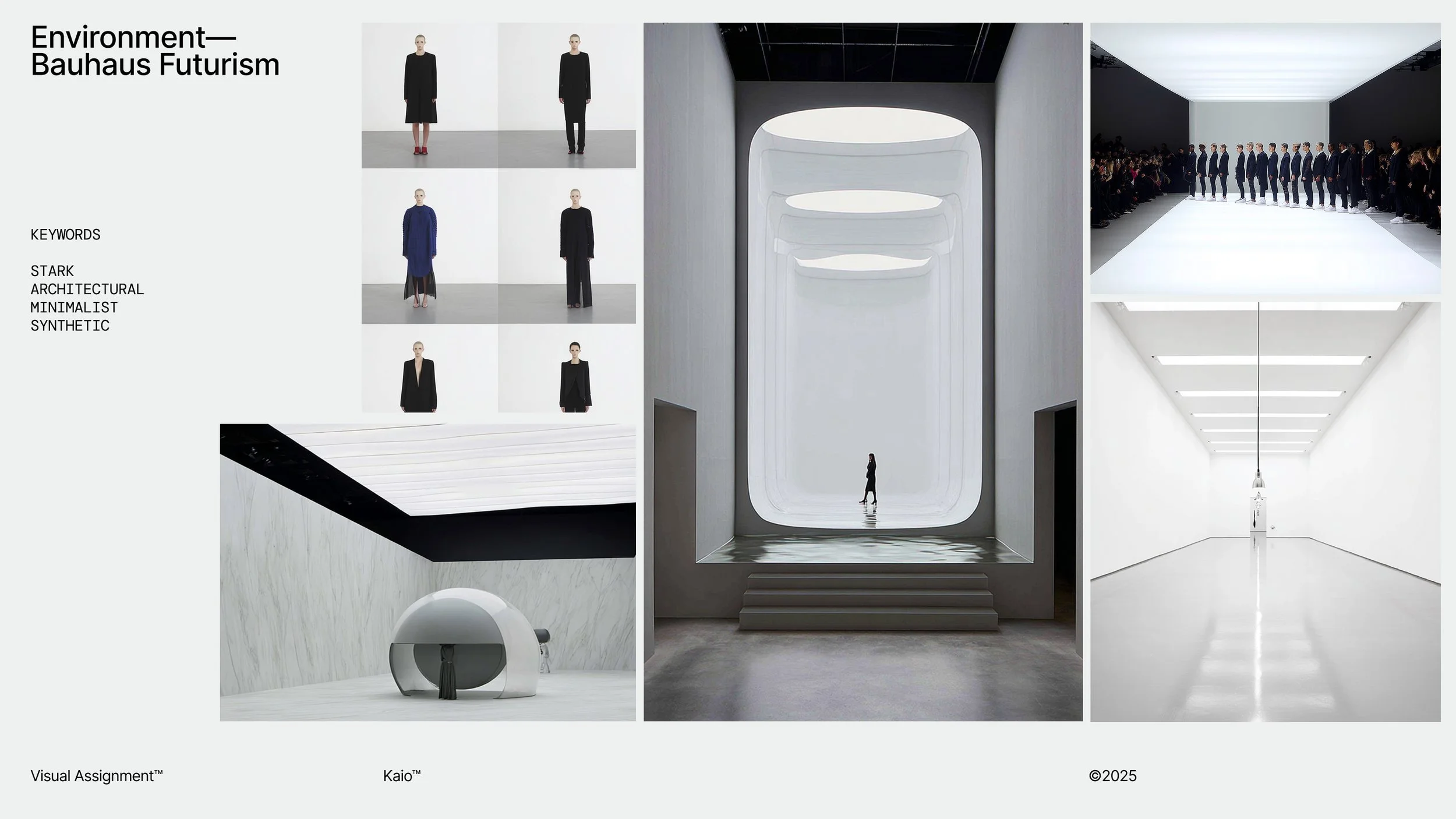
Art Direction — Environment
We designed a fully AI-generated set of environments to serve as the visual stage for the brand’s campaign content. Inspired by the structured clarity of Bauhaus and the controlled minimalism of a photography studio, each space was crafted to feel both elevated and intentional. Through prompt engineering, we established a consistent spatial language that allowed for variation without compromising visual cohesion.
Sound Design
The Kaio™ sound identity was fully AI-generated to complement the tone and rhythm of the campaign. Designed using ambient and industrial textures, subtle glitch flourishes, and a deep, dark bass foundation, the sound expresses a constant state of forward movement. The result is an audio identity that feels both meticulously structured and endlessly evolving—mirroring Kaio™’s visual and conceptual world.

Video Treatment
Framed as an avant-garde video lookbook—the campaign transforms movement into a fluid, expressive visual language that embodies creative flow. Designed to scale seamlessly across digital platforms, the lookbook brings Kaio™’s “Always in Motion” ethos to life through a modular system of looping visuals, adaptable layouts, and layered motion sequences.
OOH Advertising —Digital
The digital out of home advertising campaign embraces a 'prototype' ethos—revealing the design process rather than concealing it. Each execution showcases working files, prompt fragments, and layered visuals to frame the campaign as an evolving work-in-progress. Rather than polished perfection, the ads position Kaio™ as a brand in motion—where experimentation is the aesthetic.
OOH Advertising — Offline
The offline out-of-home campaign uses overlapping compositions that echo and fragment the core product form. Each poster captures the sneaker in multiplied expressions—creating tension between precision and distortion, symmetry and disruption. This layered visual system transforms static media into a dimensional expression of motion, revealing a brand always evolving, never singular.

Brand Film
The Kaio™ brand film is a fully AI-generated visual piece that turns walking into a continuous act of expression. The film blends fashion-forward motion with layered digital aesthetics to showcase the sneaker as both performance and design object. It acts as the cinematic centerpiece of the campaign—embodying rhythm, repetition, and conceptual form.
Social
The social system for Kaio™ was designed to scale the campaign across social platforms through a series of looping visuals, layered typographic treatments, and editorial-style layouts. The result is a cohesive digital presence that turns video content into a fluid extension of the brand’s experimental identity.
Website
The website experience is a seamless extension of the brand ethos—minimal, bold, and always in motion. Anchored by the AI-generated brand film and looping visual assets, the site acts as both a product showcase and a living editorial. Every interaction reinforces the experimental identity of Kaio™, turning the launch of the 01.7A into a digital performance.
AI-enabled brand systems.
CASE STUDIES

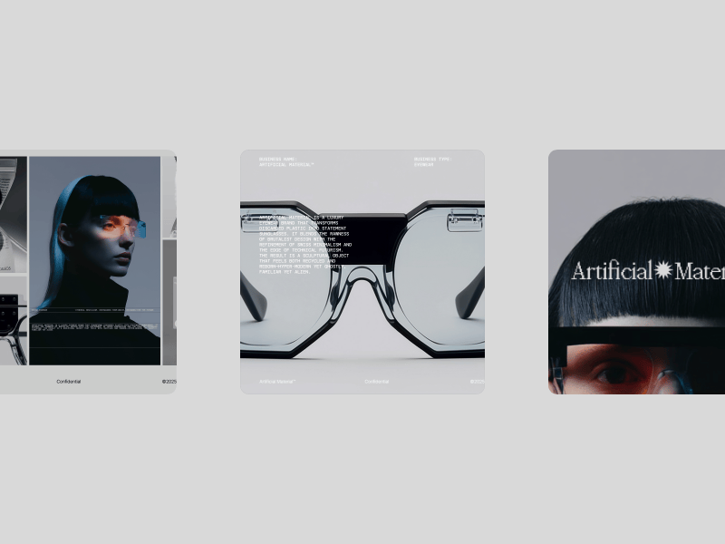
AR4™

Yikoshi™

(森)MORI™