(森)MORI™
AI-enabled textiles.
PROJECT DETAILS
-
(森)MORI™ was born from a collaborative process between human vision and machine intelligence, using AI to shape strategy, language, technology, color and material. The result is a fully realized brand system that blurs the line between imagination and execution.
-
Using our AI-Enhanced Brand System, we developed a modular, scalable identity built to evolve with intention and precision. The process included naming, material-driven design principles, wordmark design, and the creation of a design language rooted in Expressive Colorism. Every element was crafted in collaboration with AI, treating it as a creative partner to explore the outer limits of brand imagination and execution.
-
The outcome is a fully realized speculative brand that redefines how AI-enabled textiles can be expressed—bridging earth-conscious chemistry, storytelling, and cultural aesthetics. From technology naming to visual language, (森)MORI™ establishes a new paradigm where materials are both functional and emotionally resonant. The result is a brand world that feels premium, poetic, and primed for meaningful collaboration across industries.
Rooted in the Japanese philosophy of living in harmony with nature, (森)MORI™ was designed to reimagine textiles as a regenerative force—where every fiber is born from earth and used with purpose. The experiment is a future vision where materials are not simply designed, but stewarded—with beauty, intention, and reverence for the living world.
The Origin
The origin of (森)MORI™ began with a single question: What if a textile brand felt more like an art experiment than a commercial product? This inquiry led to a deep exploration of nature, resulting in a name—森 (MORI), meaning “forest” in Japanese—that honors harmony, regeneration, and emotional connection to the earth. From this foundation emerged the brand’s ethos, Organic Expressionism, where sustainability becomes a canvas for storytelling, feeling, and form.

Brand Ethos
(森)MORI™ is guided by the ethos of Organic Expressionism—a belief that products born from nature can be bold, expressive, and emotionally resonant. By transforming plant-based materials into vibrant textiles rich with color, pattern, and texture, the brand redefines what natural design can look and feel like. The result is a visual language that celebrates nature not as something to simplify, but as something to amplify.

Color
The color palette is anchored in cream, black, and sunshine yellow—symbolizing purity, contrast, and the sun’s life-giving energy that fuels plant growth. This core is expanded with a secondary palette of blue, green, pink, red and orange, bringing playful vibrancy and emotional depth to the brand. Together, the colors embody the belief that earth-conscious chemistry can be both grounded in nature and joyfully expressive.

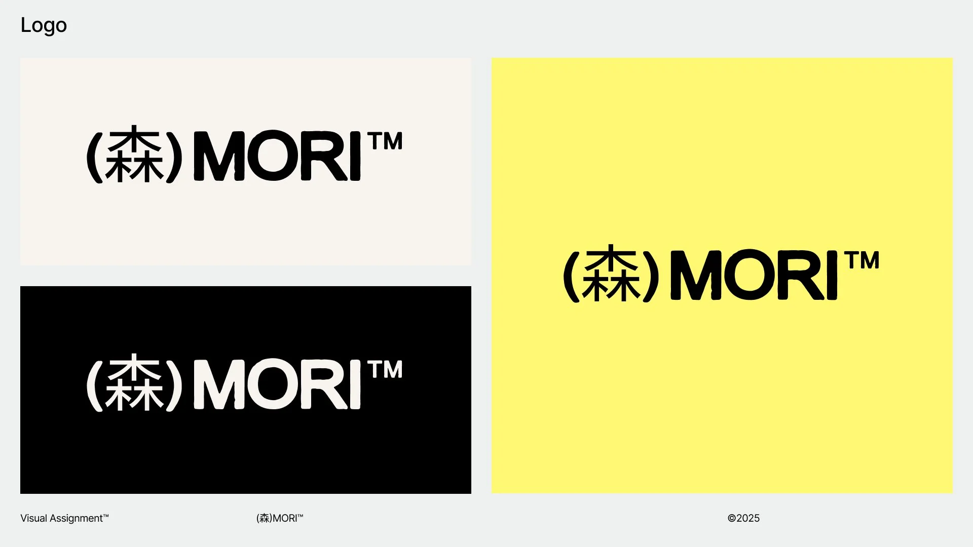
Logo
The (森)MORI™ logo is a bold, structured wordmark set in all caps—designed to convey strength, clarity, and timelessness. Anchored by the Japanese kanji 森(meaning “forest”), the mark pays homage to the brand’s philosophical roots in principles of balance, simplicity, and harmony with nature. The combination of Western typography with an Eastern character forms a unique visual bridge—symbolizing the convergence of tradition and innovation, natural materials and advanced design.
Type
The typography system communicates reverence and reinvention—pairing the timeless elegance of Old Standard TT, a classic serif rooted in tradition, with the bold, contemporary edge of Bootzy TM, a modern sans with attitude. This contrast reflects the core philosophy: honoring the past while fearlessly shaping the future. Together, the typefaces create a visual rhythm that is both grounded and progressive, refined yet expressive.

Art Direction
The Contemporary Nomadism art direction blends streetwear utility with poetic self-expression—celebrating layered textiles, headwear, and scarves as both protection and identity. Inspired by movement, adaptability, and cultural hybridity, the styling reflects a lifestyle that is rooted in freedom and shaped by personal ritual. The result is a visual narrative that feels editorial yet grounded—where every layer tells a story of place, purpose, and quiet resilience.

Ink Technology
AquaReal™ is a water-based dye technology that brings fabric to life through earth-conscious chemistry. Its visual language is ambient and chromatic—flowing seamlessly across textiles with hues inspired by nature’s own palette. Designed to be as gentle on the planet as it is vibrant in tone, AquaReal™ transforms textiles into living canvases of color and emotion.

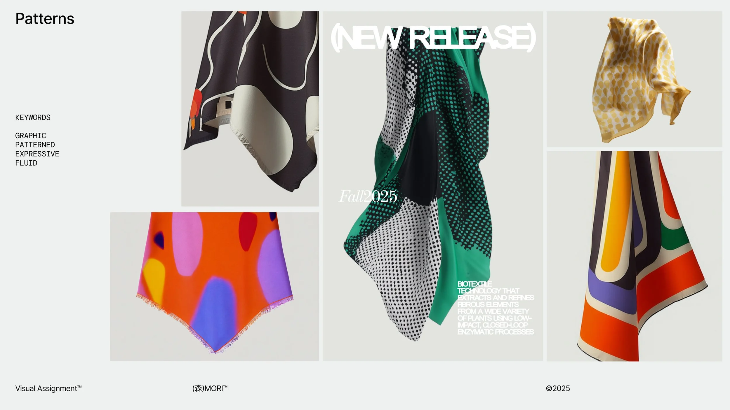
Patterns
The (森)MORI™ scarf collection explores how regenerative materials and AI-assisted design can merge to create wearable expressions of nature, emotion, and story. Each scarf features original patterns that reflect the brand’s ethos of Organic Expressionism, blending natural dyes, fluid compositions, and heritage-inspired ornamentation. The result is a collection that feels both timeless and experimental—designed to be worn, remembered, and returned to the earth.
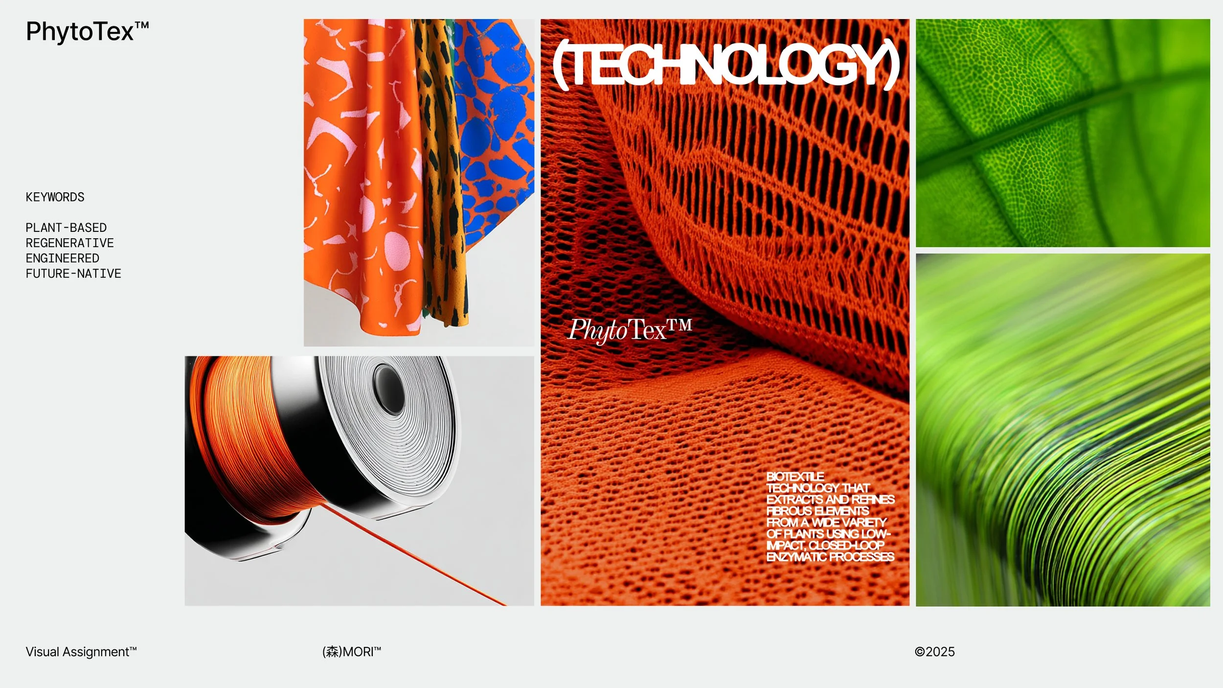
Fabric Technology
PhytoTex™ is a fully plant-based textile innovation engineered to be regenerative by design—returning to the earth as naturally as it came. Built through advanced biofabrication, it combines performance with environmental intelligence, offering a sustainable alternative without compromise. As the foundation of (森)MORI™’s material system, PhytoTex™ represents a future where textiles are not extracted, but cultivated in harmony with nature.
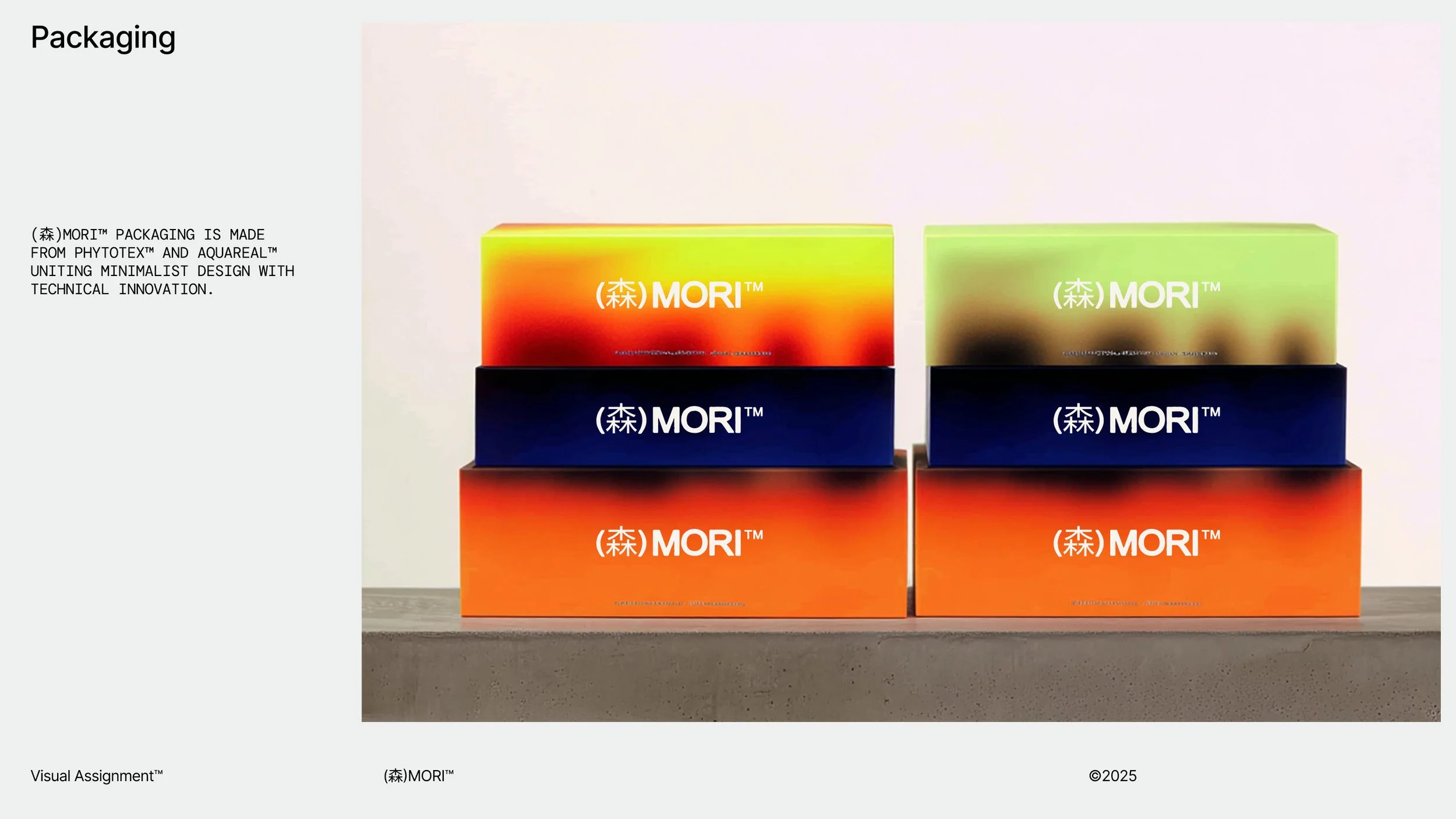
Packaging
The packaging system is crafted from PhytoTex™ for material and AquaReal™ for color—designed to return to the earth as naturally as it came. The minimalist box design blends industrial elegance with organic intelligence, pairing bold color fields with soft, biodegradable structure. More than just a container, each package becomes part of the (森)MORI™ story: planet-friendly from the first touch to the final trace.
Advertising
The advertising approach is built on a simple, poetic framework: Plant, Process, Pattern. Each campaign traces the journey of our textiles—from living botanical origins, through regenerative innovation, to expressive design—creating a narrative that’s both grounded and elevated. By honoring every step of the material lifecycle, (森)MORI™ invites the viewer to see sustainability not as a feature, but as a story woven into every thread.

Event Marketing
The "Nothing Wasted" screen installation is an immersive digital experience that visualizes the (森)MORI™ ethos through motion, color, and form. Blending the expressive visual language of Organic Expressionism with the fluid, nature-derived palette of AquaReal™, the installation transforms waste into beauty—capturing the regenerative journey of material from plant to pattern. Designed as a meditative loop, it invites viewers to witness sustainability not as absence, but as transformation.

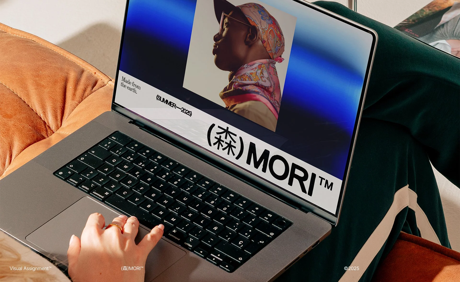
Website
The website is designed as a digital extension of the brand’s ethos—clean, immersive, and rooted in Organic Expressionism. Seamlessly blending storytelling with product, the site guides visitors through the world of PhytoTex™, AquaReal™, and eco-conscious design with tactile visuals and intentional pacing. Every interaction feels like a curated experience, where sustainability meets emotional resonance and technology becomes art.
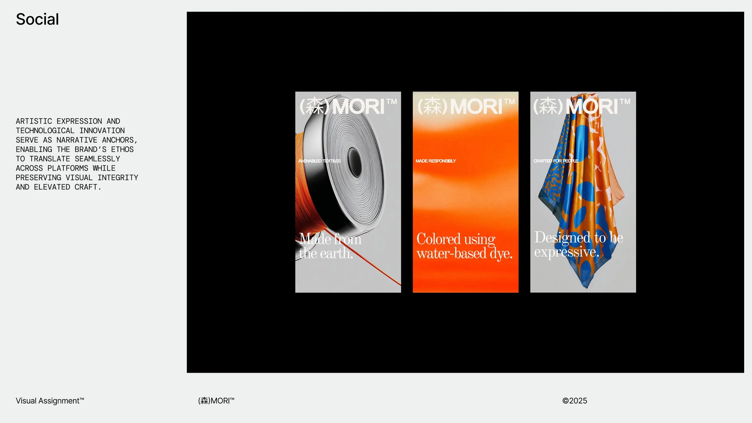
Social
The social approach is rooted in storytelling that elevates plant-based innovation through poetic visuals and design-led content. Each piece of content is treated as a curated gallery, showcasing Organic Expressionism through layered styling, material process, and immersive color narratives.
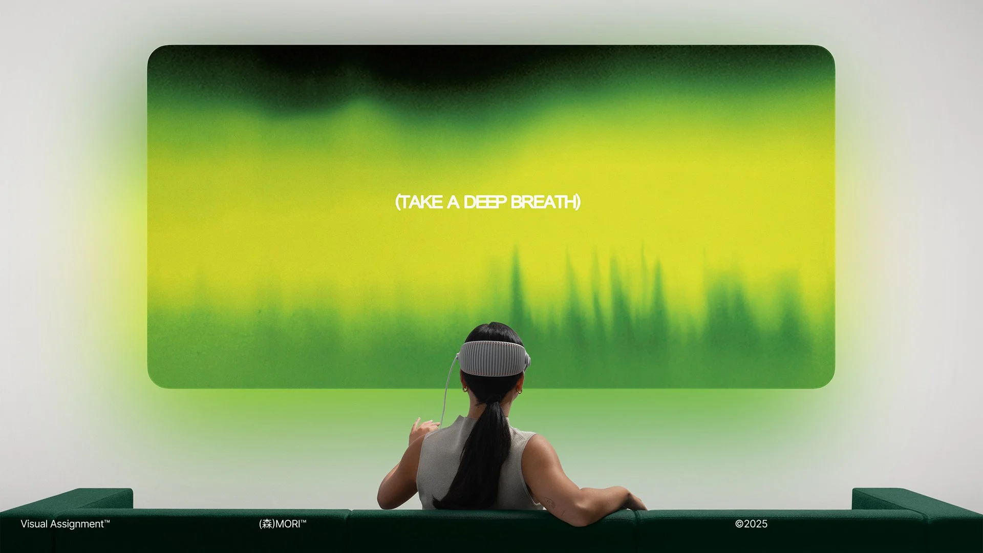
VR
The VR Experience is a fully immersive digital environment where color becomes a living, breathing landscape—flowing around the user in ambient waves derived from nature’s own palette. Designed to enhance concentration and emotional well-being, the experience responds to movement and breath, guiding users through shifting hues that promote clarity and optimism. More than virtual escapism, it’s a sensory meditation—where the regenerative power of color and nature converge in a space designed to calm the mind and inspire the spirit.
AI-enabled brand systems.
CASE STUDIES

Artificial Material™

AR4™

Yikoshi™